Perfecting our Graph with GGPlot2
At this point, we’ve gone over how to make a scatterplot in R using ggplot() and geom_point(). We have also added another function onto our code to add a title to our graph (ggtitle()). Our graph is starting to look more presentable, but it’s still going to need a lot of polish before we can call it a finished product.
From here, we’re going to need to add several more functions to make our graph into something a general audience can read and understand.
To recap, here is what our graph looks like thus far:
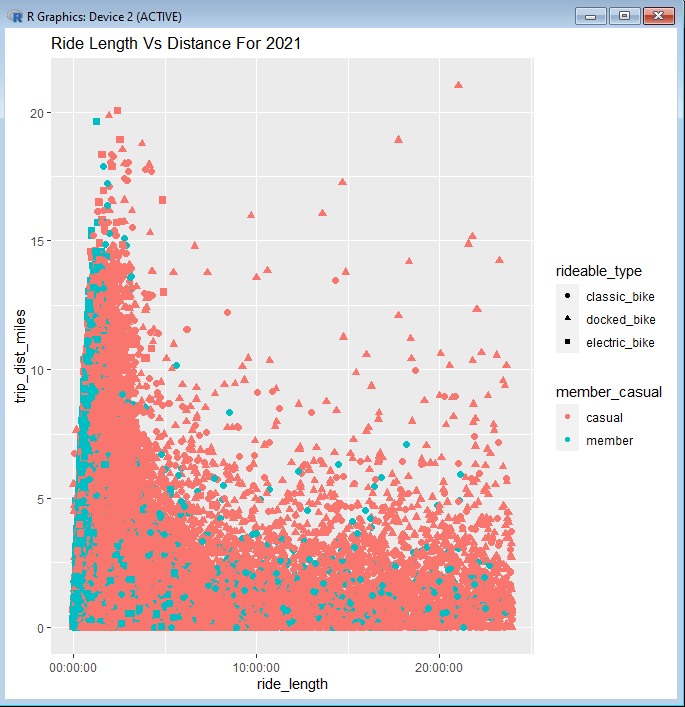
It has a title and the points have been brought up in size so that we can see them more clearly. These changes made the graph more approachable, but the labels and legends are still named in a manner that would confuse anyone who was not working in our spreadsheet before.
We’ll start with our labels on the x-axis and y-axis. They are written as “trip_dist_miles” and “ride_length” currently. We want to change these labels to say “Distance (Miles)” and “Ride Length (Hours)”. This can be accomplished by using the xlab() and ylab() functions.
As you might have guessed by their names, xlab() is used to change the label on the x-axis, and ylab() is used to control the label on the y-axis. We simply need to nest the desired names of our labels into their respective functions and add both of those functions to our line of code.
Our code should now look like this:
ggplot(all_year, aes(ride_length, trip_dist_miles, color = member_casual, shape = rideable_type, stroke = 1.5))+geom_point()+
ggtitle(“Ride Length Vs Distance For 2021”) + xlab(“Ride Length (Hours)”) + ylab(“Distance (Miles)”)
And this is the result:
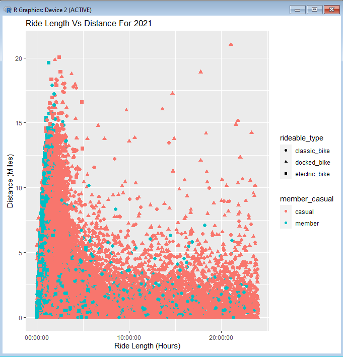
Now the labels on our x-axis and y-axis are looking a lot cleaner. But we still have those rather clumsy titles on the legends of our graph.
Where the legends say “rideable_type” and “member_casual”, we are going to want to change them to say “Type of Bikes” and “Type of Membership”. To achieve this, we are going to use the guides() function in conjunction with it’s sister function, guide_legend().
The guides() function is used to make changes to the elements of a graph that fall outside of what we’ve accomplished with the aes() function. It’s particularly useful when working with the legends along the side of our graph.
To change the titles in our legend section, we’ll need to nest a two guide_legend() functions inside of our guides() function. It will be one for each legend title.
Starting with the legend that shows the type of bike each rider was using, we’ll write the guides() function and make sure we add (+) it to the side of our code chunk. Next, we want to ask ourselves: What visual element did I assign this column data to in the aes() function?
Looking back at our aes() function, we see that “shape = rideable_type”, which means we are going to want to use “shape” to change our title.
Within this first guides() function, we are going to use guide_legend() and write: shape = guide_legend(). The last step is to write the title that we wish to use inside of the guide_legend() function, using quotation marks. Since we want to name it “Types of Bikes”, our guides() code snippet should now look like this:
+ guides(shape = guide_legend(title = “Types of Bikes”)
We’re almost finished with this function. All that’s left to do is add a comma at the end of our first guide_legend(), making way for the second one. Repeat the process for the second guide_legend(), using “color = guide_legend(“Type of Membership”)”. Now your entire code line should look like this:
ggplot(all_year, aes(ride_length, trip_dist_miles, color = member_casual, shape = rideable_type, stroke = 1.5))+geom_point()+
ggtitle(“Ride Length Vs Distance For 2021”) + xlab(“Ride Length (Hours)”) + ylab(“Distance (Miles)”) +
guides(shape = guide_legend(title = “Types of Bikes”),color = guide_legend(title = “Type of Membership”))
And our graph should look like this when the code is ran:

Excellent! Our graph is really coming together! But there are still changes that we need to make before this can be presented to anyone.
The main thing that sill needs to be improved is the values that are listed in the legend. These would be the words you see underneath the titles in the legend, like “classic_bike” or “casual”. We want to make these words appear neater by capitalizing them and separating them with spaces (“Classic Bike” and “Casual”).
Just like with the guide_legend() functions and the legend titles, changing the values inside of the legend will be centered around remember what aesthetic element each legend corresponds to. Namely, this would be shape for “Types of Bikes” and color for “Type of Membership”.
Editing the labels for our legends comes down to using two functions: scale_shape_discrete() and scale_color_discrete(). Each of these functions corresponds to the element in the legend that it’s named after. They allow us to target these parts of the legend and edit them the way we see fit.
To change the labels for our “Types of Bikes” legend, we would use scale_shape_discrete(). Nested inside of our function, we assign an array to our labels by writing “labels = c()”. The final step here is to put the names that we want for our labels within the array, starting from top to bottom and with each name in quotation marks. The code chunk for scale_shape_discrete() would look like this:
scale_shape_discrete(labels=c(“Classic Bike”, “Docked Bike”, “Electric Bike”))
We repeat the same process for “Type of Membership” with scale_color_discrete(). Putting our desired label names into an array, the code chunk looks like this:
scale_color_discrete(labels=c(“Casual”, “Member”))
After adding both code chunks to our code line, we have this result:
ggplot(all_year, aes(ride_length, trip_dist_miles, color = member_casual, shape = rideable_type, stroke = 1.5))+geom_point()+
ggtitle(“Ride Length Vs Distance For 2021”) + xlab(“Ride Length (Hours)”) + ylab(“Distance (Miles)”) +
guides(shape = guide_legend(title = “Types of Bikes”),color = guide_legend(title = “Type of Membership”))+
scale_shape_discrete(labels=c(“Classic Bike”, “Docked Bike”, “Electric Bike”))+
scale_color_discrete(labels=c(“Casual”, “Member”))
And running that line generates this image:
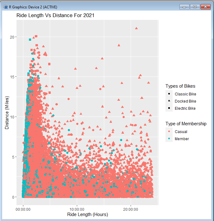
Congratulations! We now have a legible graph! It would be alright to use a graph like this in a presentation, but there are just a few more finishing touches that can be made to improve it.
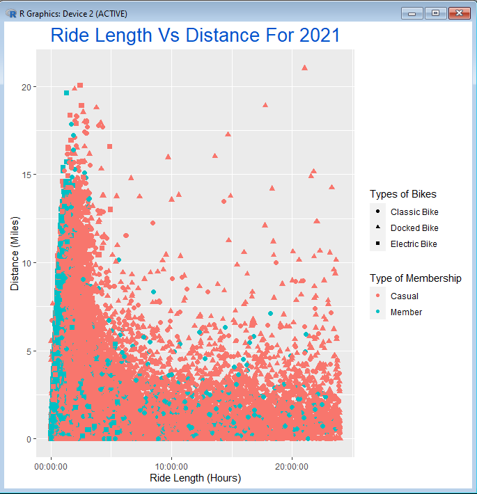
The thing that glares out to me about the current graph is its title. All of the words are readable now, but they are a bit small and do not stand out the way that a title should. I want to change the color, size, and position of my title in order to make it stand out from the rest of the graph. All of this can be done through a single code chunk, based in the theme() function.
We can use the theme() function to change aspects of the overall theme for our graph. It serves as a base function in which other functions are nested to give the precise changes that you want. To make the changes to the text element of our title, we will nest the element_text() function inside of theme().
Within theme() we are going to write “plot.title = element_text() “. This indicates that we are focusing on the title of our graph, and that it is the text itself that we are changing. From here, we want to put the actual changes we wish to make inside if element_text().
To change the color to a light shade of blue, we will write “colour = ‘#0052cc'” inside of element_text(), and follow it with a comma. The next thing is to make the text larger by writing “size = 20”. Finally, we are going to change the position of the title by using vjust and hjust values, which alter the texts vertical and horizontal positions respectively. We will write “vjust = 1,” followed by “hjust = 0.5”. Keep in mind that the range for both values is between 0 and 1.
When all of these changes are finished, we should have this code chunk:
theme(plot.title = element_text(colour = ‘#0052cc’, size = 20, vjust = 1, hjust = 0.5))
And our overall line of code for the graph should look like this:
ggplot(all_year, aes(ride_length, trip_dist_miles, color = member_casual, shape = rideable_type, stroke = 1.5))+geom_point()+
ggtitle(“Ride Length Vs Distance For 2021”) + xlab(“Ride Length (Hours)”) + ylab(“Distance (Miles)”) +
guides(shape = guide_legend(title = “Types of Bikes”),color = guide_legend(title = “Type of Membership”))+
scale_shape_discrete(labels=c(“Classic Bike”, “Docked Bike”, “Electric Bike”))+
scale_color_discrete(labels=c(“Casual”, “Member”))+
theme(plot.title = element_text(colour = ‘#0052cc’, size = 20, vjust = 1, hjust = 0.5))
Our graph with an improved title should now look like this:
To finish up our graph, we should improve the labels on our x-axis and y-axis by making them larger and lifting them a bit further from the chart. We will do this by using the same method of nesting element_text() inside of theme(). This time around, we will write “axis.title.x = element_text()” to change our “Ride Length (Hours)” label, and “axis.title.y = element_text()” to change “Distance (Miles)”.
We will add this final code chunk to our overall line of code:
theme(axis.title.x = element_text(size = 13, vjust = -0.1))+
theme(axis.title.y = element_text(size = 13, vjust = 2.2))
And this is the final result for our graph:
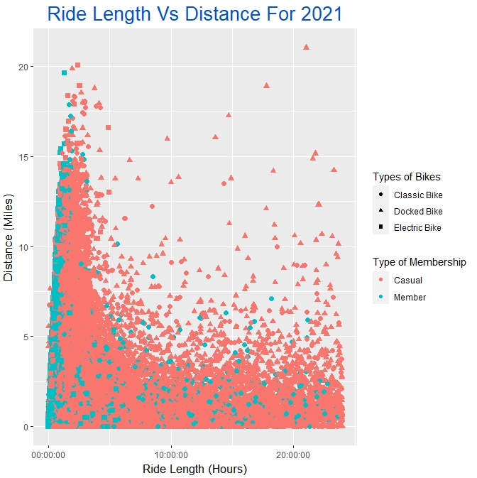
Now’s the moment where we pat ourselves on the back, because we finally have a graph that is ready to be presented!
The only thing left to do with our graph is to save it. We are going to want to create a new subfolder within “2021 SQL Queries” and call it “Analysis Images”. With our final image selected in R, click File in the menu bar and then select Save As. Choose the PNG option and then proceed to save the image of our graph into the “Analysis Images” subfolder we have just created.
And those were some of the finer points of making data visualizations in R by using ggplot(). In our next post, we will quickly go over the datasets that we should be sure to make graphs out of. We’ll also talk about different kinds of graphs needed for our data visualization goals, and how R can be somewhat limited in meeting those goals.