Creating a Summary Sheet of Our Data
By now, we have used SQL to organize our data in ways that begin to tell the story of our overall dataset. We’ve ran some basic queries that provided simple summary information, which can be used in a presentation of our findings. Though this data on it’s own doesn’t tell the whole story, it does provide some important details that are worth going over.
Before we go on to create visualizations of our more extensive query results, we are going to move our summary data into a single spreadsheet that we can reference later. This is mostly going to be the queries that brought up Mean, Max, and Mode data.
We can start by making a new subfolder in our 2021 Marketing Analysis folder to store the queries that are specifically made to show summary data. We’ll place this subfolder in our “2021 SQL Queries” folder and name it “Summary Data”.
The next step would be to export each query into the Summary Data folder as a separate CSV file. Be sure to name your CSV files in a way that explains exactly what data is meant to be shown.
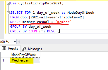
Take a look at this example of summary data:

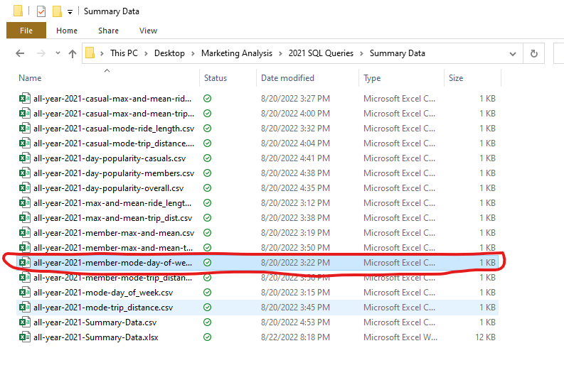
Here we can see that the query is made to show the most popular day among members in our dataset. When exporting these results into our Summary Data folder, we will want to name it something that explains it’s purpose. We’ll name this query “all-year-2021-member-mode-day-of-week”.
Here is what that query will look like as a file in our Summary Data folder:

Once you have exported all of the useful queries into this Summary data folder, the next step is to open up a blank document in Excel. We’ll save this document in our folder and call it “all-year-2021-Summary-Data”. We now have a blank canvas in which we can add our data to.
Now we will want to open up our csv files individually, then copy and paste the data into our Summary Data sheet. You should have named your data in a way that shows what groups are represented in each sheet.
For instance, I saved a query that showed the overall max and mean trip distances. That file was named “all-year-2021-max-and-mean-trip-dist.csv”. I also saved a query that shows the max and mean trip distance for causal riders. This one I named “all-year-2021-casual-max-and-mean-trip-dist.csv”, making sure to specify that this data only showed these values for the causals.
When pasting our data into the Summary Data sheet, it’s important to keep everything organized based off of the membership categories. We’ll start by making an “Overall” section that shows the overall max and mean values for trip distance and ride length across the entire dataset. We’ll also include the overall most popular day for all riders.
Simply find the sheets which contain this data, then copy and past the cells into the Data Summary sheet. Place these cells directly next to each other, making sure to leave an empty row above them. We’ll use that empty row to house the title “Overall”.
Select all of the cells directly above our data in the empty row. On the Home menu, select the “Merge & Center” option, located in the Alignment tab. Once all of those cells have been merged, type your “Overall” title into the new cell and make sure it is in bold.
Finally, choose a color scheme for all of this data. I recommend making each column have a unique color that stands out from the one next to it. Also, pick a color for the title cell that stands out from the rest.
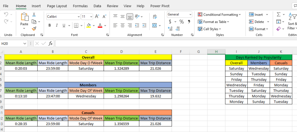
We’re going to want to repeat this process for all of the queries we exported into our Summary Data folder. In my Summary Data Sheet, I entered all of the data mentioned above for each category (Overall, Members, Casuals). I also included data that ranked every day of the week by popularity amongst these categories.
The result of my Summary Sheet came out like this:

Be sure to save this as an Excel Workbook, in order to make sure that all of the sizing and color changes will be saved.
This file will come in handy later, when we are ready to put our first presentation together. It also serves as a basic introduction to the concept of visualizing our data. By sorting all of our data into boxes and using color to show how this data is organized, we have used visual elements to help illustrate our findings.
In the next post, we will take visualizations to the next level. We’re going to take our dataset and create charts and graphs that will help paint a picture that tells our data’s story. To do this, we are first going to jump back into our R workspace to see utilize it’s potential for data visualization.