Creating More Visualizations with Tableau
We were able to use R to make visualizations of our data that were precise and customized to our liking. R is a great tool for hand-crafting graphs to suit our project, but it is a bit complex to work with. Tableau is another tool that we could use to make visualizations, and its much easier to use.
Tableau is a BI tool that is more UI based, meaning it does not require writing code to use it. It’s a great tool for making data visualizations that are simple and easy to understand. We should always considering using Tableau in conjunction with R, as it lacks certain customization options that can be found in R. As a rule of thumb, if you can make a visualization in Tableau, it’s much faster to do so.
I use Tableau Public, which is the free, browser-based version. The basic concepts I’ll be going over in the post can be applied to any of the paid versions of Tableau as well. If you’re following along, you’ll want to sign up for Tableau in order to continue.
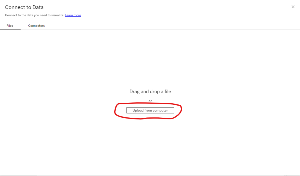
Once you’ve signed up for Tableau, you’ll want to go onto your account page and click the blue button on the top left corner of the screen that says “Create a Viz”. This will open up the Project window in Tableau. It’s at this point that you’ll be greeted by a window that asks you to import the dataset that you will be working with. Here is where you can put in our latest version of the Cyclistic spreadsheet (all-year-2021-v3).You can either drag and drop the file into the box, or click the button that says “Upload from Computer”, like so:
With our dataset loaded into Tableau, we are ready to begin creating visualizations. We’ll start with an easy one. Let’s start with a basic bar chart that will show the total number of rides in 2021, comparing the number of member rides to those of causal riders.
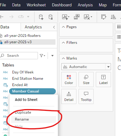
On the left side of the screen, there should be a panel titled “Data”, which has the names of all of the columns in our dataset. We are going to want to look for the one that says “member_casual”. The name listed for that column in this panel will be the one that will display in our graph. Since “member_casual” is a bit of an eyesore, we’re going to change the name to “Membership Type”. Right-click on “member_casual” and select the “Rename” option:
From there, a pop-up window will prompt you to type in the new name. While we are at it, now would be a good time to name our sheet. If we haven’t already been prompted to name our sheet, we can simply right-click on the sheet tab on the bottom of the screen and select the “Rename” button to mimic this process. The name you choose for the graph will now appear at the top of the main work panel.
With both our sheet and our data renamed, we can move on to bringing our data into the workspace. We’ll start by selecting what kind of graph we will be working with. In the “Marks” panel towards the left of our workspace, make sure to open the dropdown menu and select “Bar” for a bar chart.
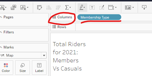
Now, we need to decide what data to put into our “Column” and “Row” panels , near the top of the workspace. The Column panel will determine what data should be going into the x-axis of our graph. Since this is a bar chart comparing members to casuals, we’ll want to put Membership Type in this panel. Simply drag Membership Type into the Column panel and drop it in there:
Next, we will consider what will go in the Rows panel, directly below the Columns panel. The data going into the Rows panel is what will populate the graph, and can be considered what is measured in the y-axis.
Since we can get the count of members and casuals throughout the data set by adding up the amount of time our “member” and “casual” values are listed, we will also put Membership Type in our Rows Panel. But before we do that, let’s drop it into the “Marks” panel, so that we can work on the data a bit before loading it into the workspace.
The main thing we need to do to this bit of data is edit it’s “Measure” value. If we were to drop it into the Rows panel as is, we would only get the words “Member” and “Casual” in the visualization, and not the data. We need to add a Measure to it, in order for these values to be counted. We just have to right click on our Membership Type button that we dragged into Marks. From the drop down menu, go to Measure and then select “Count”. This will give perform the Count function, in order to count up all of the times the values within the data are listed. Once we’ve selected Count, simply drag and drop the Membership Type button into the Row Column.
A visualization like this should be load into the workspace:
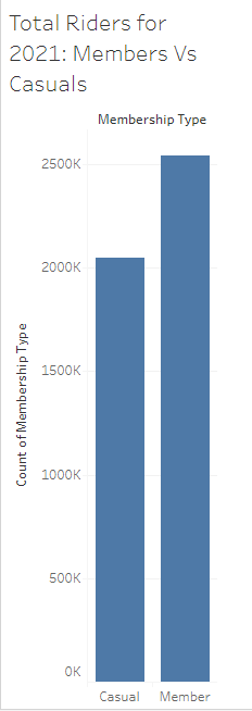
This is a good start to our visualization, but there are a few things that can be done to improve it. First, we can add some color to the bars, in order to add more of a visual queue that these bars represent two different types of riders.
We can do this by going back to Data panel and selecting Membership Type button again. If we drag the Membership Type button into the Marks panel, we can drop it over the tab within it called Color. When we drop Membership Type over the Color tab, the Marks panel should look like this:

Doing this tell Tableau to automatically assign colors to the visualization based on that column of the dataset (Membership Type). The result will look something like this:

That’s a lot better! This visualization can still be customized a bit more, if we see certain elements that we would like to change. For instance, take a look at the label on our y-axis. A label like “Count of Membership Type” may be a bit long and over-descriptive. The visualization already has a label at the top that tells us this data represent the different types of riders. We can shorten the label on the y-axis to just say “Count”.
To do this, just right-click on the y-axis of the chart and select “Edit Axis”‘:
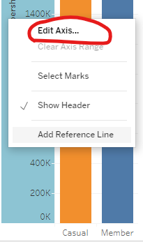
This will bring up a new window that allows you to edit elements of the y-axis in our visualizations:
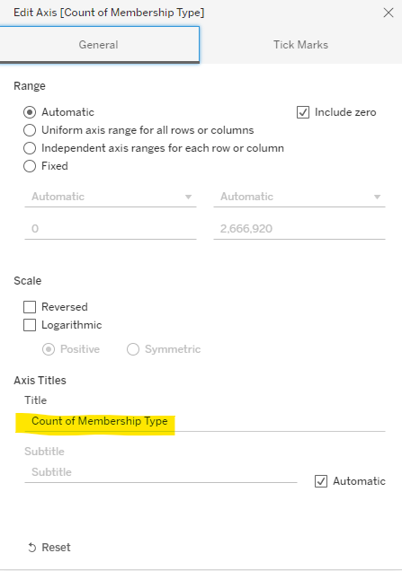
As you can see, there are many options here to change what we see on our y-axis. For now, we are just going to focus on changing the title. In the Axis Titles section of the window, we can replace “Count of Membership Type” to simply say “Count”.
And here is the result:
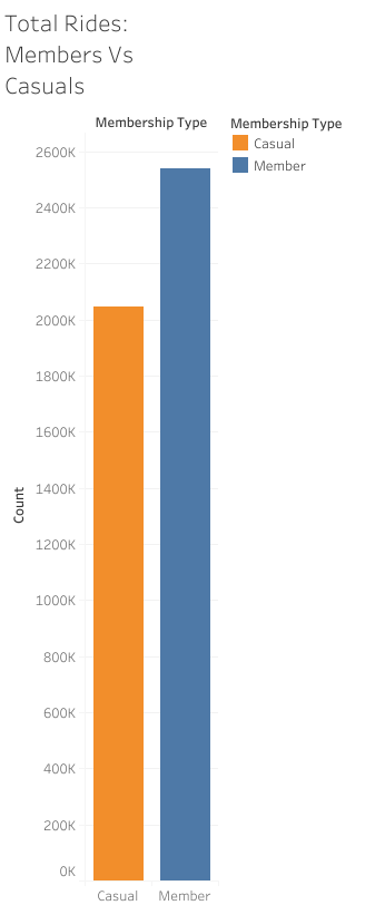
The y-axis looks a lot cleaner now. There is another problem with this graph, though. When we look near the top of our visualization, there are two labels that say “Membership Type” located right next to each other. One is the title for our Columns data (x-axis) and one is the title for our legend. We should get rid of one of these, just so that our graph will look cleaner and less redundant.
We can get rid of the header for our Columns data by right-clicking on the Membership Type button in the Columns panel. From the drop down menu, we want to make de-select the option that says “Show Header”. When we click on that option, the check mark next to it goes away and gives us this result:
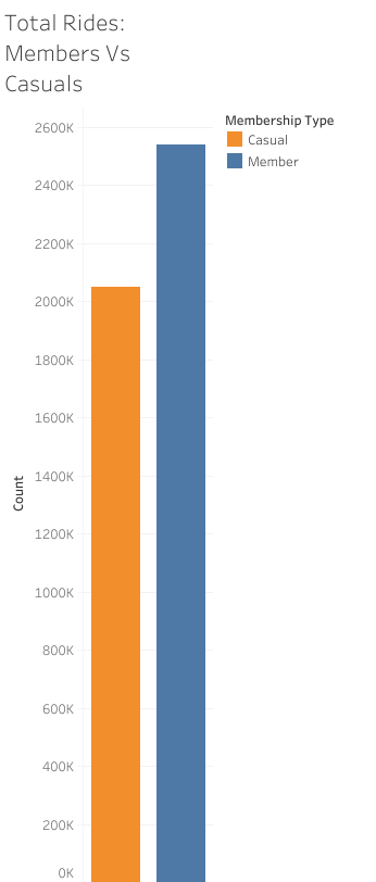
Now the graph is looking clean, simple, and ready to present to shareholders.
You may have noticed that when we de-selected the “Show Header” option, the labels along the x-axis was removed as well. This shows some of the limitations of working with Tableau over R. In Tableau, certain elements and features of a graph can be tied to others, meaning that both will be removed if you decide to get rid of one. This is one of the drawbacks of the streamlined process that Tableau offers us.
With that being said, Tableau is still an essential tool in an analyst’s arsenal. There are loads of visualizations that can be made in Tableau for a fraction of the time it would take to write out the code in R.
By just using the basic steps that we’ve gone over, you can craft even more elaborate visualizations. Let’s take a look at a slightly more complex bar chart that we can make with our data.
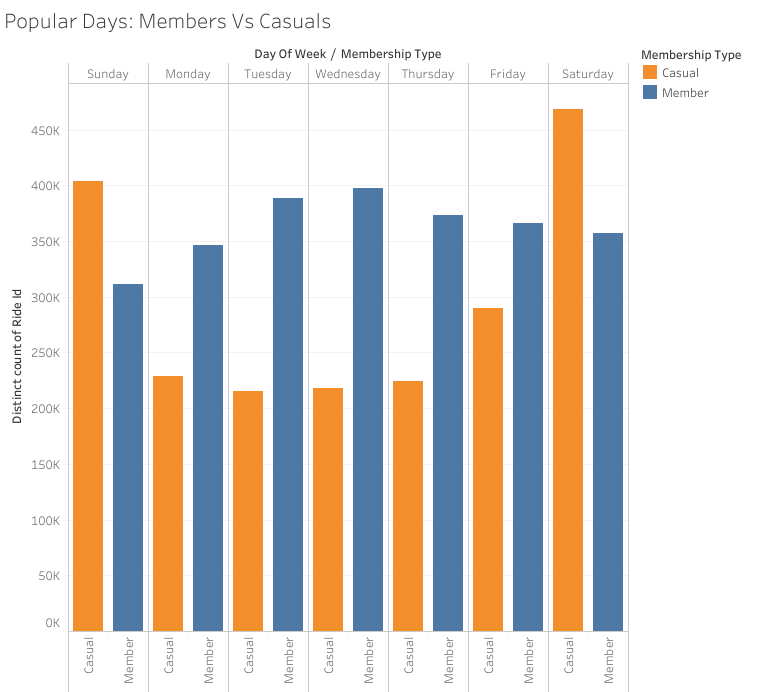
This graph shows the popularity of each day of the week for our riders, comparing the total number of casual riders and members for each day. If we examine the elements of the graph closely, we can see the way that it was constructed in Tableau.
The title of the y-axis is “Distinct Count of Ride Id”. This means that the Rows column is drawing data from the Ride Id column in our dataset. The Ride Id button that was placed in the Rows panel has a Measure feature added to it that counts every distinct value in Ride Id. Since each row in the dataset is marked by a distinct Ride Id, this Measure will count every row as a ride.
When we look at the header for data in the x-axis, we see that it says “Day of Week/ Membership Type”. This means that the Columns panel is going to have both a Day of Week button and a Membership Type button inside of it. This shows that our data is divided by both the day of the week and the type of membership that each rider had. We can even see the sub-headers along the x-axis that show the type of membership on the bottom of each bar, and the day of the week at the top.
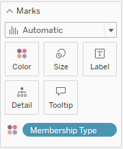
Lastly, we can see that there is color used to distinguish the bars that represent members from those for casual riders. That means that we have a Membership Type button in our Marks panel that has been dropped into the Color tab.
This is what all of these buttons look like from inside their panels:

With these basic concepts, you can create effective visualizations of a dataset without having to dive into complex coding. Creating additional visualizations in Tableau will help us close up the analysis phase by going over the data and charts that we have drawn up over the course of this project. We are almost ready to jump into the last phase of the project.