Data Visualization with R: GGPlot2
The last post was a light refresher on working in an R workspace and uploading data into that workspace. With our desired SQL exports loaded into R, we can now begin creating visualizations of our data. This will help produce images to represent the numbers, and will aid in our presentation of this data to our stakeholders.
One of the great packages in R that can be utilized for data visualization is called ggplot2 . If you recall from our Loading Page, it is one of the packages that we will want to load up every time. ggplot2 is a host to various functions which we can use to not only create visualizations, but to fine tune our visualizations to suit the needs of our projects.
The main function used in ggplot2 comes in the form of the base function, which is ggplot(). We use ggplot() to both indicate that we are making a visualization and also to specify what data we will be working with. There are multiple ways to make use of the ggplot() command, but for now we’ll just use it to specify the data that we are working with.
We’ll start our first visualization by using ggplot() to specify that we want to work with the Docked Bikes dataset. For this part, we just need to specify that the data for the chart will be docked_bikes, which is the value that I assigned to the Docked Bikes CSV file. Simply nest data = docked_bikes into the ggplot() function. So far, your line of code should look like this:
ggplot(data = docked_bikes)
Now that the data has been specified, we can set the parameters for the actual graph. First, we’ll have to decide what kind of graph or chart we’ll want to use.
In order to get a birds-eye-view of out data, we’ll want to pick a visualization that can show the information of riders both individually and as a whole. This would be a good opportunity to use a scatterplot.
A scatterplot is a graph that uses points on a chart to show the relationship that a certain data point would have with criteria placed along the x-axis and y-axis. We can use a scatterplot to see how far a rider may have gone on a trip (Trip Distance) and how long they took on their ride (Ride Length). When data for the whole year is placed onto a scatterplot, we can begin to see patterns emerge between all of the points that have been plotted on the graph, with each point being an individual rider.
Within the library of functions made for the ggplot2 package, the geom_point() function is used to create scatterplots. There are several elements for the graph that will need to be nested inside of the geom_point() function, but we will first need to attach geom_point() to our base ggplot() statement. We can do this by putting a “+” in between ggplot() and geom_point. So far, our code line should look like this:
ggplot(data = docked_bikes)+geom_point()
With geom_point added to our line of code, we can now add the elements that will make up the visuals of our graph. Our geom_point statement will need the instructions for how we want the graph to be constructed. This is known as the mapping of the graph. We’ll start of by putting mapping = into our geom_point function:
ggplot(data = docked_bikes)+geom_point(mapping =)
Next, we’ll need to tell the function exactly what kind of mapping we’ll want to do. For this graph, we will focus on the aesthetics, or visual qualities, we wish to implement. Aesthetics are written in R as aes(), and we can nest the specific aesthetic elements we want to use inside the aes() function.
This is a good time to ask ourselves: What kind of elements do we want making up this graph?
Since we want to compare how far people rode their docked bikes versus how long their ride actually took, we are going to put ride length on the x-axis and the trip distance on the y-axis. We also want to compare our results between casual riders and members. This can be done by having points for members being one color and points for casuals being another.
These elements can be implemented rather easily from within our aes() function. We would just have to nest in the following values: x = ride_length, y= trip_dist_miles, color = member_casual .
As you can see, each value entered into the aes() function is assigned a column in the data that posses the information we want translated into the graph. You’re complete line of code should now look like this:
ggplot(data = docked_bikes)+geom_point(mapping = aes(x = ride_length, y = trip_dist_miles, color = member_casual))
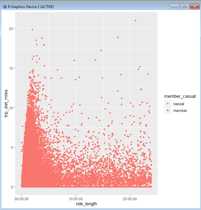
Now we get to run the line of code and see what kind of visualization R generates with it. Here’s what was generated from running this code on the given dataset:

As you can see, there are thousands of plot points scattered across the chart. There are certain patterns of behavior that we can make out from this visualization. For instance, we can see that no matter how long across the entire span of time that riders might have spent on their ride, there is a greater tendency to stay within 5 miles of their original station.
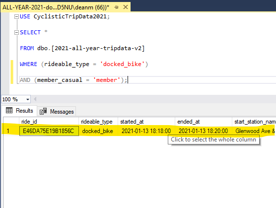
Another glaring detail about this graph is that there are virtually no members shown riding from a docked bike in 2021. In fact, when we go back into the SQL file that our dataset comes from, we can see that there is literally only one member who rode a docked bike in 2021:

If we were actually employed at the fictional Cyclistic bike-share company, we would want to confirm with the appropriate department that docked bikes were even a service offered to our members. For the sake of this analysis, let’s pretend that docked bikes are usually only rented out to casuals due to their one-time payment method.
Let’s take a look at a visualization that has clear representation of both casuals and members. We can create a similar graph for our Classic Bike dataset using this line of code:
ggplot(data = classic_bikes)+geom_point(mapping = aes(x = ride_length, y = trip_dist_miles, color = member_casual))
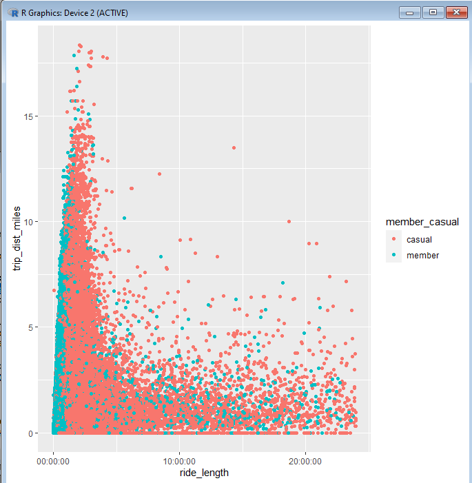
And this is the visualization that results from it:

Here we get a better picture of how members and causal riders use their vehicles differently. It’s easy to see that members tend to use their bikes for the shorter durations, even if they travel very far. This suggests that members are more likely to use these bikes as a routine commute, rather than an activity for leisure time. Such an insight can help us draw conclusions for our analysis.
This covers the basic concepts that go into making a visualization in R. In the next post, we will go more in depth into other kinds of graphs that can be made, as well as ways that we can tailor our visualization to be more presentable to our stakeholders.