Improving our Graph in GGPlot2
The concepts we went over in the last post laid down the foundation for creating data visualization in R. Now we’ll dig deeper and find out ways to customized the layout, labels, and appearance of our visualizations.
We’ll start by introducing an additional element to our graphs: shape. The shape element can be used in ggplot2 to make data points have different shapes based off of a given criteria.
Let’s use our all_year database to compare ride lengths and miles travelled amongst members and casuals. We’ll put ride_length on the x-axis, trip_dist_miles on the y-axis, members and causals will be two different colors, and we’ll use shape to show what kind of bike was used for each ride.
Adding the shape element to our scatterplot is as easy as typing “shape =” into our geom_point() function and adding the name of whatever element we wish to have different shapes. We can create the scatterplot that was mentioned above using this line of code:
ggplot(data = all_year)+geom_point(mapping = aes(x = ride_length, y = trip_dist_miles, color = member_casual, shape = rideable_type))
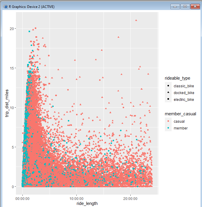
After we run this line, we get this result:

If you take a close look at the data points, you can see that they have now been changed to include different shapes than the past charts did not have made. There is also a legend on the right that shows what type of bike each shape corresponds to.
This is a good start, but it could still use lots of work. For one thing, all of the labels in this chart are using the names of the rows found in our Excel sheets. Due to the format that we chose to name our columns in, these names can be a bit jarring to look at. The chart in it’s current state is even missing a title!
All of these things and much more can be written into our code to make this chart look more appealing. However, doing so will make our code much more complex.
Luckily for us, we have already covered the basics of R coding structure when it comes to making visualizations in ggplot2. We know how to nest elements into a function and how to add functions together to make a larger statement. Now we will need to introduce some new functions, as well as expand upon what can be done with the functions we already know.
So far, we’ve been able to make simple graphs by adding ggplot() with geom_point(). To enhance our graphs further, we’ll have to do two things differently: add several more functions and change the way that we use ggplot() and geom_point().
In past code lines, ggplot() only held the name that we assigned to a given dataset. geom_point() held all of the elements that we wished to use on our scatterplot. This worked fine when we just wanted to see the patterns that the scatterplot would make once populated with data. But R will not be able to execute our code if we try to add more changes onto it using this format.
Instead, we’ll have to put all of our elements inside ggplot() and leave geom_point() empty. If we were to recreate the past line of code using this format, we would have a new line that would look like this:
ggplot(all_year, aes(x = ride_length, y = trip_dist_miles, color = member_casual, shape = rideable_type))+ geom_point()
There are several things to notice being done differently here.
First, our dataset was input into ggplot() by simply writing “all_year” as the first element. This is a shorthand way of specifying the dataset when adding additional elements to ggplot().
The next element in ggplot() is the aes() function, where we list the aesthetic elements that we wish to put into the graph itself. This remains the same as before, only that it is nested inside ggplot().
Notice that geom_point is completely empty here. It now only serves as a base function, informing the rest of the code line that this chart is meant to be a scatterplot.
Now it’s time to start adding some enhancements to our chart. Before we move on to adding new functions to our code, let’s include one more element to change from within ggplot().
Looking back at our last graph, we can see that each point on the chart is rather tiny and a bit harder to make out. We can change the size of the outline on each shape by using the stroke element. If we add “stroke = 1.5” within our ggplot() function, we’ll get a line of code that looks like this:
ggplot(all_year, aes(ride_length, trip_dist_miles, color = member_casual, shape = rideable_type, stroke = 1.5))+geom_point()
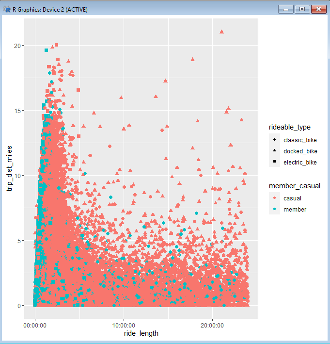
Here is a comparison between the chart before the stroke change and afterwards:


As you can see, there is a huge difference in size and visibility for each point now.
It’s time to add a new function to our line of code. The next function that we will add is simply and self-explanatory. That would be the ggtitle() function.
Like it’s name suggests, ggtitle() is used to add a title to a visualization made in ggplot(). We only need to nest the tile we want inside of the function, making sure to use quotation marks around it. Let’s give our chart the title “Ride Length vs Distance For 2021”. Adding ggtitle() to our code line, we should have this:
ggplot(all_year, aes(ride_length, trip_dist_miles, color = member_casual, shape = rideable_type, stroke = 1.5))+geom_point()+
ggtitle(“Ride Length Vs Distance For 2021”)
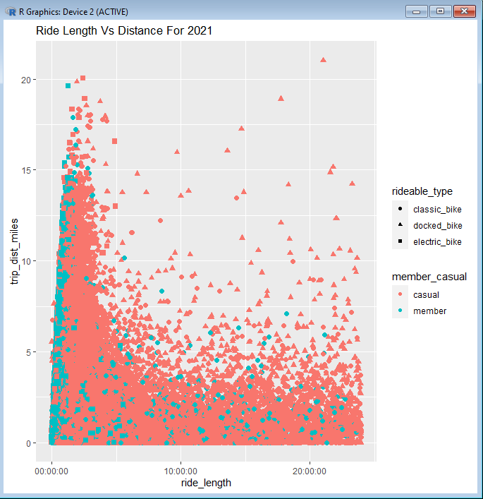
And this is what our visualization looks like now:

Now we’ve added a completely new facet to our visualization by adding an additional function to our code. This is a good start, but there are still many visual elements to this graph that will need to be improved before it can be shown in a presentation.
We will pick up from here in the next post, where we will go over several more functions that can be used to make our graph look just the way we want it.