Selecting Our Visualizations (And Knowing the Limitations of R)
As you’ve seen from the previous posts, R can be a pretty complex language, capable of making complex and precise graphs. It’s proven quite useful in making scatterplots with our Cyclistic dataset.
In the last post, we finished making a scatterplot that compared Ride Length (Hours) and Trip Distance (Miles) for each rider across the entire year of 2021. This graph even compared members to causal riders along those lines, and showed how popular the different types of bikes were amongst them. To get a better picture for how this trend shapes up at different stages of the year, we should create the same scatterplot for the four quarters of 2021.
Doing this is as simple as copying the ggplot() code lines we made for the all_year dataset and replacing the “all_year” value with the given values for our quarters (“q1_2021”, “q2_2021”, etc.).
We can start with the basic code line to create our visualization in order to make preliminary observations. As a refresher, here is what the basic code for q1_2021 would look like:
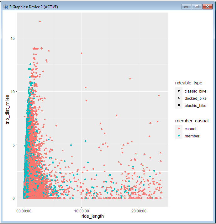
ggplot(data = q1_2021)+geom_point(mapping = aes(x = ride_length, y = trip_dist_miles, color = member_casual, shape = rideable_type))
And here is what the scatterplot looks like:

At a quick glance, we can make the general observation that was made from our all_year scatterplot. That would be the fact the fact that members tend to go for longer distances and take shorter times compared to causal riders. We should make a note in our R file and comment in our observation.
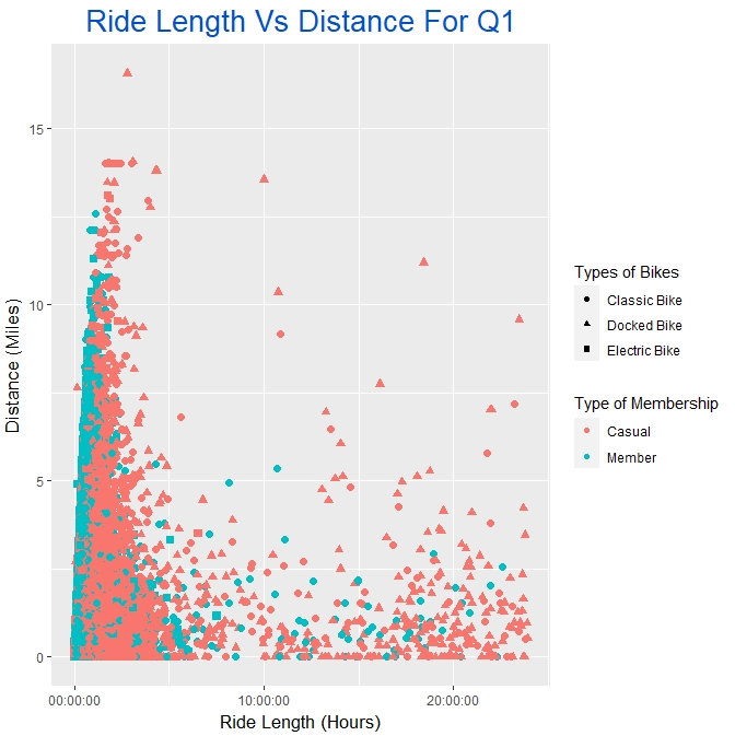
Next, we can copy the more complex code line that we used to make our final chart for the all_year dataset. All we would need to do is replace “all_year” with “q1_2021”, and then change the title to something that fits the Q1 dataset, Our improved code line should look like this:
ggplot(q2_2021, aes(ride_length, trip_dist_miles, color = member_casual, shape = rideable_type, stroke = 1.5))+geom_point()+
ggtitle(“Ride Length Vs Distance For Q2”) + xlab(“Ride Length (Hours)”) + ylab(“Distance (Miles)”) +
guides(shape = guide_legend(title = “Types of Bikes”),color = guide_legend(title = “Type of Membership”))+
scale_shape_discrete(labels=c(“Classic Bike”, “Docked Bike”, “Electric Bike”))+
scale_color_discrete(labels=c(“Casual”, “Member”))+
theme(plot.title = element_text(colour = ‘#0052cc’, size = 20, vjust = 1, hjust = 0.5))+
theme(axis.title.x = element_text(size = 13, vjust = -0.1))+
theme(axis.title.y = element_text(size = 13, vjust = 2.2))
And here is the final product:

We should duplicate the process for all four quarters, making sure to take notes of our observations along the way. As you make the chart for each quarter, continue to save them into our “Analysis Images” subfolder, like we did with the graph for the all_year dataset.
We now have a scatterplot for the whole year as well as all four quarters. But what about our smaller subsets of data. For instance, our “floaters” dataset is composed of riders who returned their bikes to their original stations at the end of their rides. We could compare the ride lengths amongst the members and the casual riders.
This kind of comparison would warrant the use of a bar chart. One bar on the chart would show the average time a causal rider takes on their bike, and the other bar would show the average time for a member. We could create a basic chart of this data by using geom_bar() instead of geom_point(). We use geom_bar() when we want to make bar charts with ggplot().
We can write a simple geom_bar() line of code to see what our results would look like for this comparison. Be sure to write in ‘stat = “identity”‘ into geom_bar, like so:
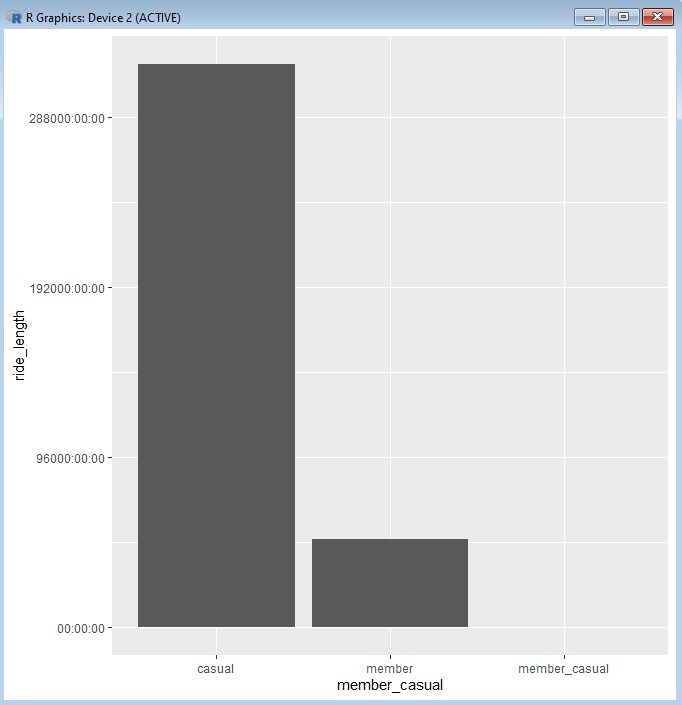
ggplot(data = floaters, aes(x = member_casual, y = ride_length))+geom_bar(stat = “identity”)
And this is the result that we get:

As you can see there are many things wrong about this graph. Although it does seem to show the different averages for our two classes of riders, the chart has added a third class that is the name of the column (member_casual). Presumably, there is a row somewhere in our dataset that has the value “member_casual” within the column named member_casual. We would want to go back into SQL and look into this.
For the sake of this post, we’ll skip that validation step, since apparently there weren’t any other values assigned to whatever row may have the faulty “member_causal” value. The focus now becomes removing this from our chart.
A code chunk we could use to remove this value would be:
filter(member_casual != “member_casual”)
The filter() function would be used to filter the value “member_casual” out of our data. However, the best way to use this function with our code is to put it through a pipe.
A pipe is a code symbol that is used to connect the data from one code segment with the code that follows it. Think of it as another way of “adding” code segments together (like we do with the “+” symbol), but in a way that is geared towards editing the code that come before it. The symbol for a pipe in R is: %>% . We will use this symbol to pipe our floaters dataset with the filter() code chunk from before. Taking care to separate our code segments with both the pip symbol and a new, indented line, our code will look like this:
floaters %>%
filter(member_casual != “member_casual”)
The pipe that we have so far will filter out the faulty “member_casual” value from floaters, but only within the “pipeline” or series of pipes that we have started here. In order to apply the filter from this pipe into a chart, we need to add another pipe into our “pipeline”.
From here, we would add a pipe right after our filter() function. After that, we can use the familiar functions that we used before in order to sculpt out the chart that we want.
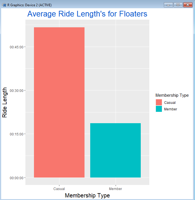
Here is a completed pipeline to create a usable bar chart with our data:
floaters %>%
filter(member_casual != “member_casual”) %>%
ggplot(mapping = aes(x = member_casual, y = ride_length, fill = member_casual )) +
geom_bar(stat = “summary”, fun = “mean”)+
ggtitle(“Average Ride Length’s for Floaters”)+
xlab(“Membership Type”)+
ylab(“Ride Length”)+
guides(fill = guide_legend(title = “Membership Type”))+
scale_fill_discrete(labels = c(“Casual”, “Member”))+
scale_x_discrete(labels = c(“Casual”, “Member”))+
theme(plot.title = element_text(colour = ‘#0052cc’, size = 20, vjust = 1, hjust = 0.5))+
theme(axis.title.x = element_text(size = 15, vjust = -0.1))+
theme(axis.title.y = element_text(size = 15, vjust = 2.2))
And here is the graph that is created from that:

Throughout the past several posts, we’ve been able to see how R and ggplot2 can be used to make visualizations with our dataset. Our use of R code enabled us to customize our visualizations to be almost exactly what we want them to be.
As much potential as there is with R, we did also notice many stumbling blocks along the way. The complexities of R code allow for a certain precision in our work, but can sometimes end up creating complications that stifle our work.
In the next posts, we will go over another data visualization tool called Tableau, which is much simpler to use and can be used to make the visualization phase of our analysis a bit more streamlined.